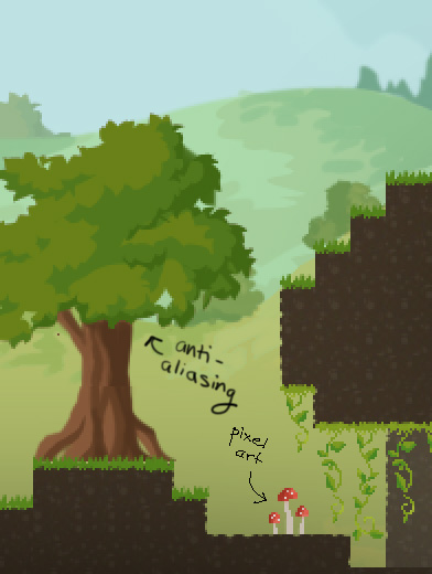
So far the art in Crea has been a mixture of pixel art for the small things, like the character and items, and anti-aliasing for the large things, such as the background and the trees.
Anti-aliasing looks smooth, and it’s really fast to make. Pixel art, on the other hand, is very crisp so it works well for rendering tiny detailed things.
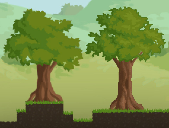
During the Kickstarter, some people said that the art in Crea looked “flat,” so I’ve been pondering ways to improve it. It occured to me that, since it was necessary to draw most of the game objects on a pixel-by-pixel basis, maybe I should just draw everything that way – except for the background. That will allow for greater foreground-background separation.
So I redrew the trees with the pencil tool.
The new tree is on the right.
Jasson agrees that this is a big improvement, and I like it as well. The objects have more dimension and solidity.
One drawback is that the pixel art is more time-consuming, but it will be worth it if it helps the game look better. The backgrounds will remain anti-aliased, which hopefully will help bring the foreground forward while preserving Crea’s unique look.


Wow, that makes a world of a difference! Take all the time you need because it’s well worth it :)!
That defiantly looks a lot better then before, before I couldn’t tell if you could interact with the trees in the world and if they were completely in the foreground but now it is much more obvious and look so much better.
Great work as always. it’s never easy to figure out what something as ambiguous as “it looks flat” might mean, and what are the causes, but you’ve clearly identified a BIG one with this.
I would still love to see more texture and depth to the tiles and grass… but things are looking better and better!
Those trees are looking great. I do think it helps pop it from the background. Bravo!
I really love when people don’t settle for the first way they created something and strive to push it, even if it is double the work. Thank you for making a beautiful game design. Really can’t wait to play this game!
been looking at your artwork and everything in general, and I thought… why dont you smoot the edges of the terrain?
the blocky style is cool, but a bit of smooting would make it look way better, add some tall grass too bushes and stuff… ive been creating stuff in pixel art too and details like rocks and small things make big change between a terrain and another.
for instance this is more like for the finished game.
add small criatures that inhabit the different biomes, bugs, birds, they create a new enviroment when you look at them.