Wow the weeks are flying by. Already at week 17 on these recaps! Are you guys enjoying these recaps? I appreciate the comments you leave on these posts.
This week I worked on fixing up colored lights, gave lava a light source and started reworking the talent skills. I already showed off the colored lights and lava earlier in the week in this post.
The skill rework is fairly extensive. Much of it has been behind the scenes so far. I am restructuring some things and prepping for many more skills to be added. Not all of the changes are in the infrastructure though.
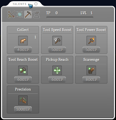
The Talent UI has been needing some love for quite some time. Here is what I came up with so far.
In addition to looking much better, there are a few other improvements. The character’s current skill level is now displayed in the upper right corner. I may change the placement in the future, but I just wanted to get it in there and move onto more important things.
Another improvement is when hovering over the skill icon, a tooltip for the current level (or level 1) appears. When hovering over the button to level the skill up, a tooltip will appear to explain the next level. Soon tooltips will include the cost and cooldown time for active skills.
This next week I’m going to continue working on the skills. There are many new skills that will be added. These will likely keep me busy for the entire week. If I do manage to finish them up then I’ll move onto working on the underground once more.


New Talent UI is looking really good! The simplification makes everything much cleaner and easier to understand.
I’m really liking the new design! 8D Can’t wait for more skills!
nice skill improvement i do agree with the change, they look way more layed out and you can do a lot with those slots.
As for the research theres a heck of a lot of that i hope if you do a remake of those then please keep them somewhat easy :P. anyways good to see an improvement in the UI..
I didn’t even know those were skills before! I thought they were just placeholder text. Boy am I dumb. Looks much better now
Looks really good!
I love the recaps, the recaps are awesome